Digital Monoprint #2 Eureka?


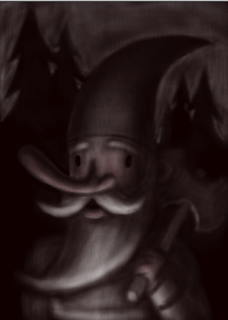
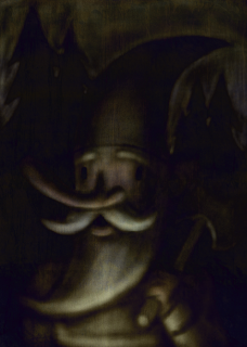
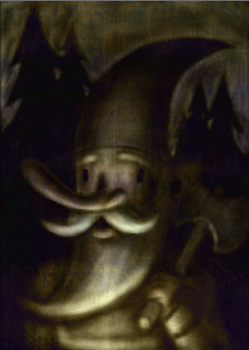
HUGE Thanks to Jon for sending some Monoprint Photoshop brush textures he found. This actually is a tremendous help towards getting a more realistic texture. I created this bg with the brushes, copied it into the gnome file and then used the Difference filter at an opacity of 60%. The result is kinda spooky… Then I tweaked the contrast/brightness of the original image and added some more highlights back in.

I’m trying to shoehorn it after the fact here, so I think if I were to start over with the new bg, more fun things would happen. I’ll keep messing around and post the results.

Thanks, Jon!

Real Monoprint

As mentioned in my last post, here’s the real McCoy. It wouldn’t all fit on the scanner bed, but you get the idea. Since the ink is oil based, there’s a bit of viscosity so neat things can happen and it can hold the textures of objects. You can also ink over top of your original wipeouts and add more colors. I think this was a 3 color experiment. This was probably circa 2000-2002.

Digital Monoprint


Awhile back I visited a monoprint class that Mr. Mofongo was attending at the former Atlanta College of Art. The teacher was gracious enough to let me do a plate and try it out. Look for that in the next post. Fast forward to last year: I had the idea to try the same technique of extracting an image out of a solid dark color with varying photoshop brushes and the eraser tool. I finally had the time to sit down and try it out. I think it turned out ok for a first attempt. The undo feature is a great tool here to test out different tones and mark making, but unfortunately this method doesn’t allow for the spontaneous effects and things that are inherent in pulling ink off a plexiglass plate. Still, it’s a pretty neat effect and I’m sure lots can be simulated with the right brushes and texture overlays. Definitely something to keep trying and experimenting with…

Real Brushwork Flash


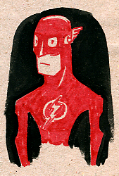
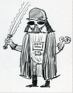
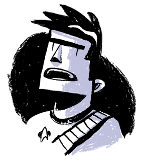
I’ve pretty much tapped my harddrive for goodies, however I did find some old sketchbooks looking for the Star Wars drawings in the previous post. I found some good stuff so I’ll continue to post the harvest. This was a drawing of the Flash done with a real brush pen and some black watercolor on natural paper. It may not come through the scan, but the really rich matte black of the watercolor is pretty cool in person on the kraft paper.

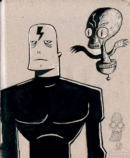
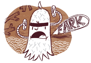
Fark.


Funny things come out when you’re tired and just doing stream of consciousness/reactive illustration. I just started drawing and here’s what came out. I have no idea what it means, however I did eat a lot of bean dip this evening.

More AI CS3….

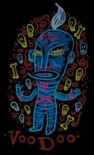
Voodoo That You Do


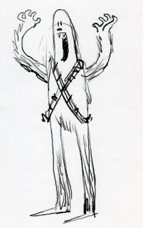
More hard drive excavation revealed this little ditty from 2002. My recollection was that I had just purchased a Wacom Graphire tablet and I was testing out the brush pressure sensitivity in Illustrator. It’s a decent color sketch, might be something good to build upon as one of those new pieces I’ve been rambling about.